USING VISUAL LANGUAGE TO COMMUNICATE
THE VOICE OF COMFORT WOMEN :
HUMAN RIGHTS & HISTORY
This thesis tackles issues involving human rights by using visual language to form a visual narrative about the experience of those whose rights have been violated. It’s understood that many people experience the violation of their human rights throughout the world. For a graphic designer, the issue becomes how to effectively represent the experience of those whose rights have been violated. In this thesis I focus on how to represent through visual language of the human rights experiences of Comfort Women.
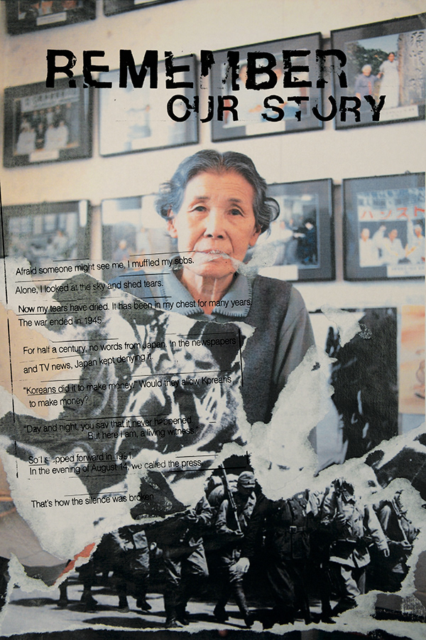
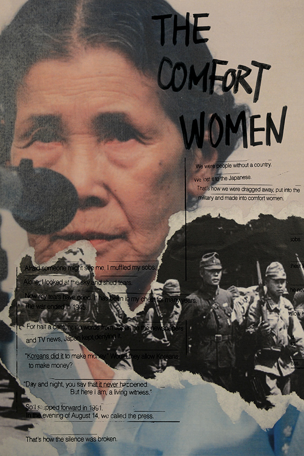
unfinished story
The Unfinished Story project features the activism of Kim Bok Dong who came forward in 1992 to testify about her experience as a wartime sex slave and who spent the remainder of her life fighting for victims’ rights on behalf of the “Comfort Women.” The narration, given by a Korean-American in her Korean tongue, expresses Koreans' feelings about the pain and suffering of the “Comfort Women”. In this “Unfinished Story” project, I arranged historical documents, photographs, and videos to provide a visual narrative of the lives and history of the “Comfort Women.” The timeline visually captures Comfort Women’s history. Against the imagery of collages and a photo-montage of images and videos, the Korean song “Ye Mac A-Ra-Ri” begins in the project and a sad piano supports the history of the “Comfort Women’s” life. As each new scene starts, moving images of pictures, collages, and videos appear within a red circle to capture the experience of the “Comfort Women’s” and to provide a link to women’s rights issues.
unforgettable
The Unforgettable project uses a metaphorical approach towards objects. It approaches the public through familiar materials in everyday life and suggests how to convey a message by showing the nature of objects or by stimulating emotions. Specifically, the first step below is to visualize the combination of black ink and white flower. The symbolic objects are shown in the video, revealing the sorrow of the Comfort Women.
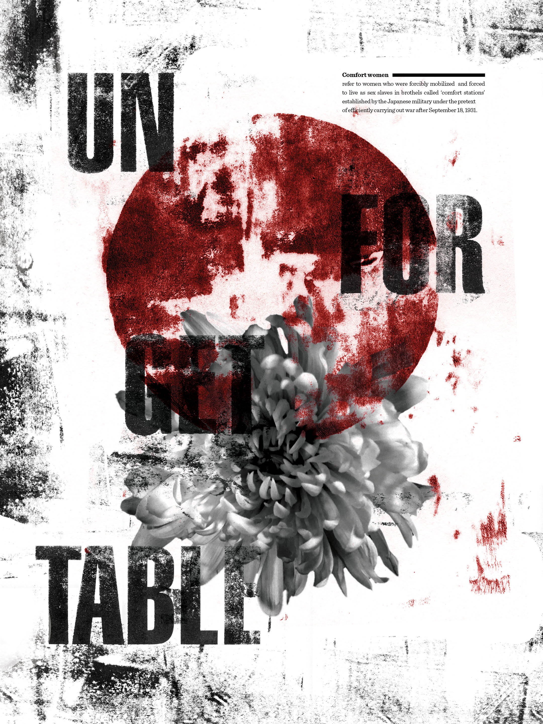
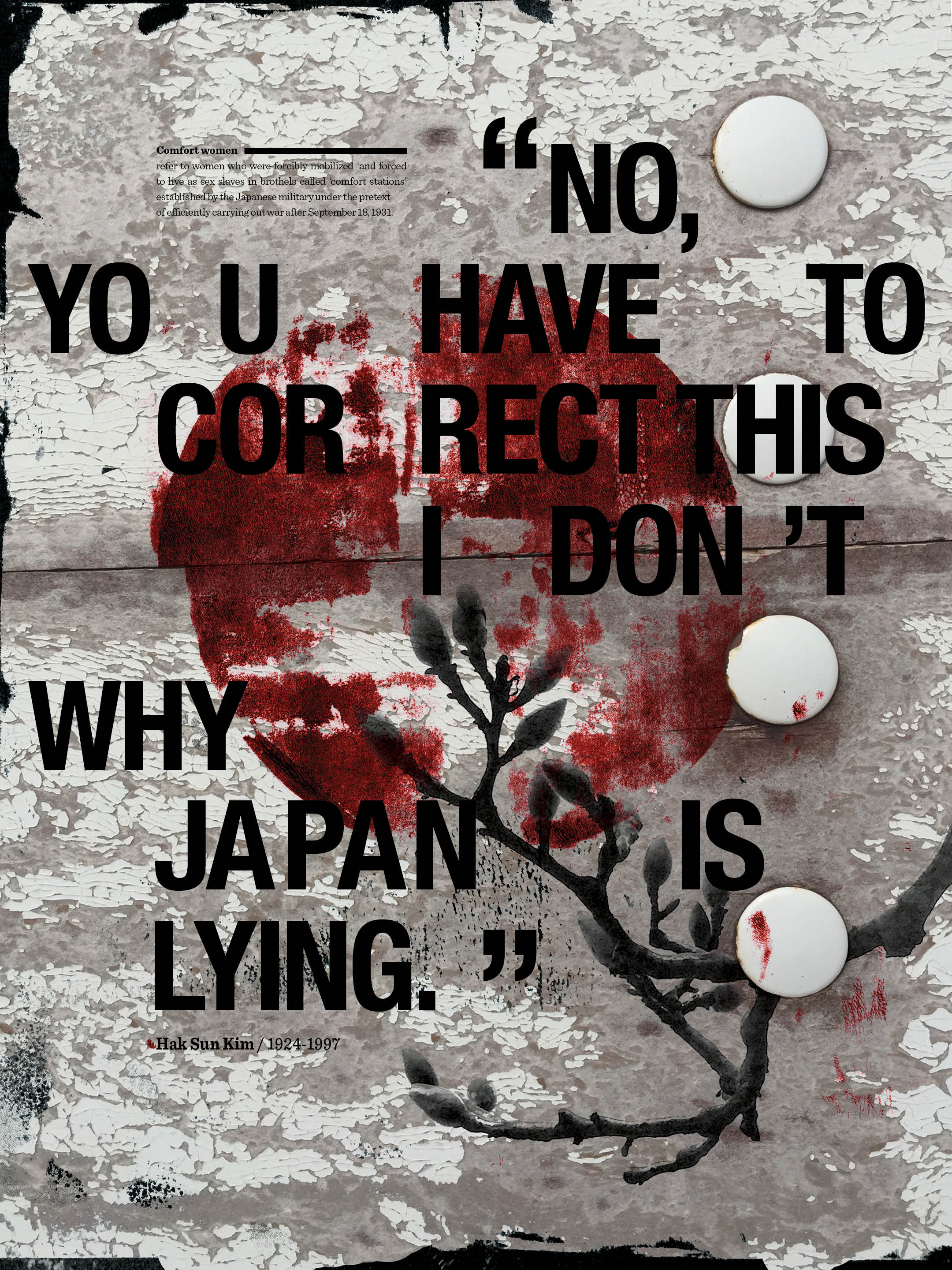

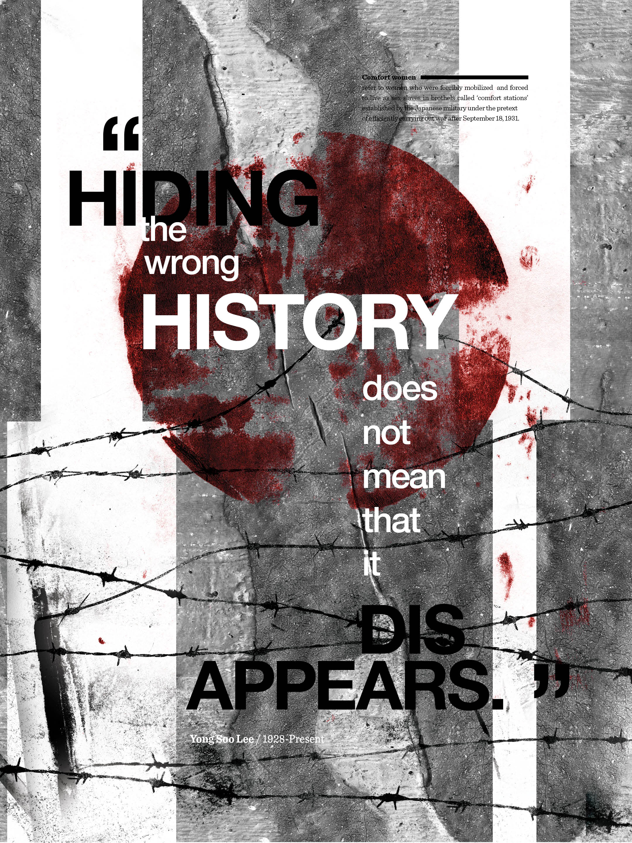
In a related poster design, the red circle of the Japanese flag is placed on a blooming chrysanthemum flower to create the meaning that the Japanese dominated the Comfort Women as represented by the chrysanthemums located below The flag. The expression of texture in the red color symbolizes blood and death, and the chrysanthemum flower represents the comfort of the dead. Red circles and flowers create a confrontational situation.
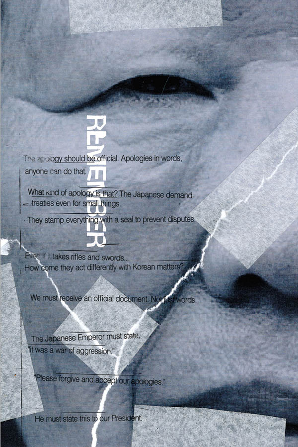
comfort women time capsule
The stop motion of the ripping paper effect is the basis of the Time Capsule Project which forms a narrative of events.. The images of the show-time visualize the evidence of recent times. This project explores the historical images expressed in visual language about Comfort Women's voices and elements of their arguments. The tearing paper effect indicates that the Comfort Women have pain as part of their history.