OSU_MFA_MoGraph
During my time as an MFA candidate at Oklahoma State University, I had the opportunity to collaborate with —Mario— a fellow grad student. We designed a bumper to introduce the three main focuses of the OSU graduate design program [Motion, Interaction & Visual Communication].
We decided to restrain ourselves with iPhone and GoPro cameras. In this collaboration, we captured dynamic and experimental footage by shooting through magnifying lenses and multiple glass objects. The goal of this project was to create practical motion effects— this process allowed us to abstract letterforms and discover the possibilities when the creative process is guided by pure intuition. The final motion sequence is a montage of spontaneous results.
INVICTUS
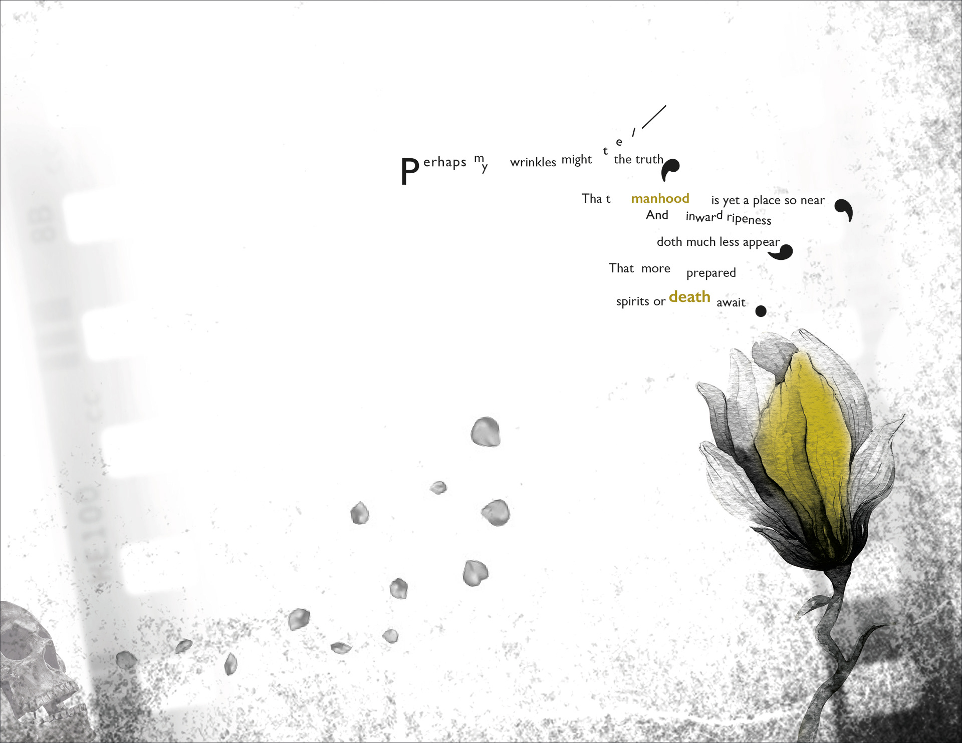
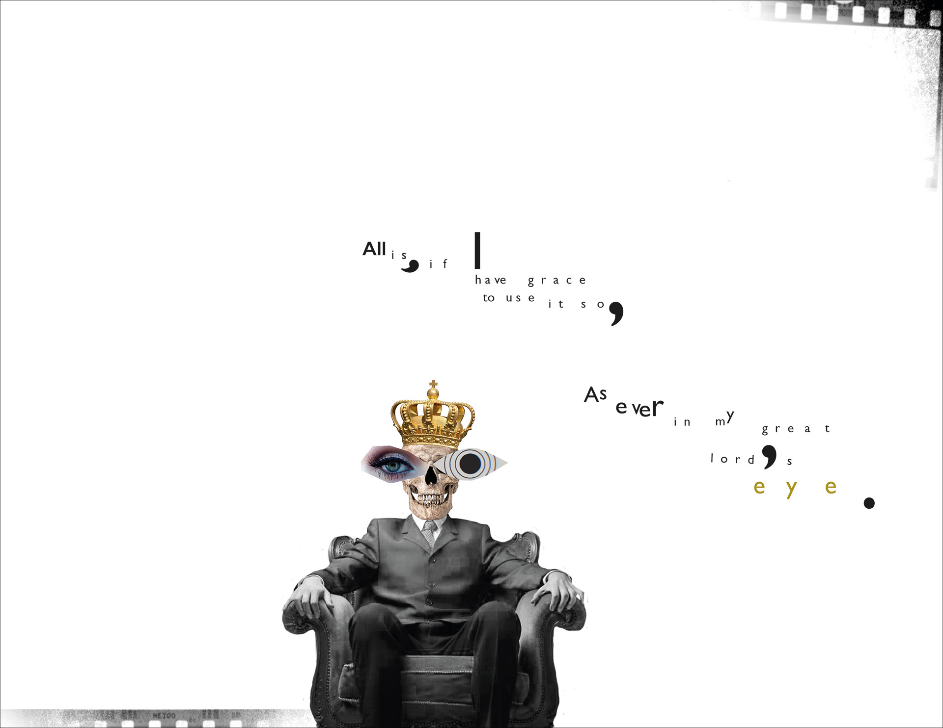
Concrete Poetry

Concrete, pattern, or shape poetry is an arrangement of linguistic elements in which the typographical effect is more important in conveying meaning than verbal significance. It is sometimes referred to as visual poetry, a term that has now developed a distinct meaning of its own.
Intentional Exposure

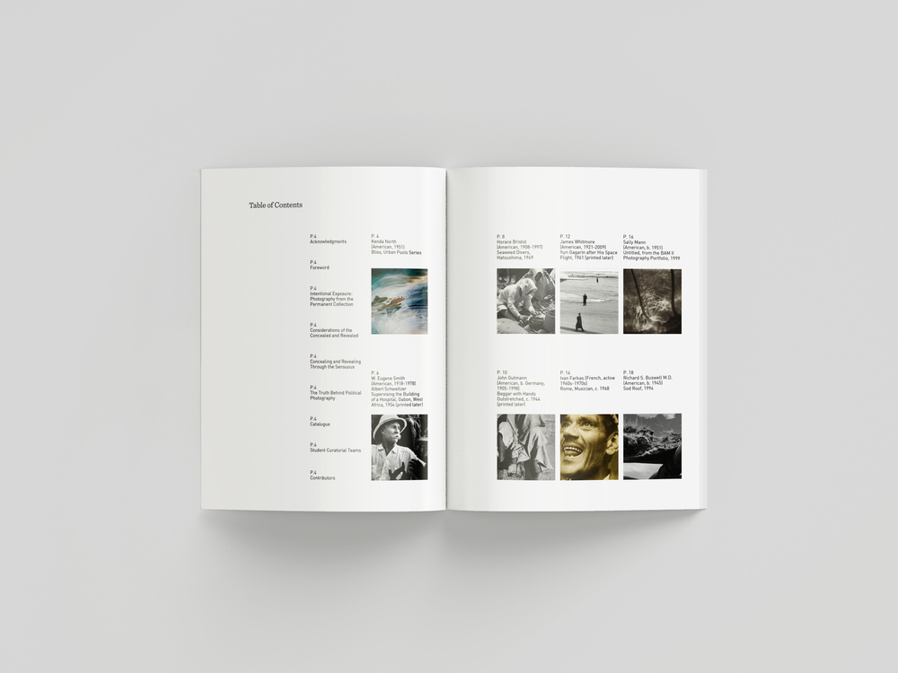

Under the direction of Dr. Louise Siddons, Oklahoma State University students enrolled in the History of Photography and Museum Exhibitions course have carefully curated and selected the photographs in this collaborative show. All are drawn from the permanent collection of photography at the Oklahoma State University Museum of Art, and most were on display for the first time. The exhibition highlights donations from Robert Flynn Johnson, who has been a donor to the university since 2011. —p.17 excerpt
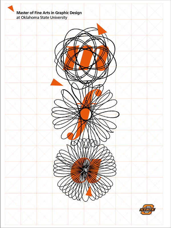
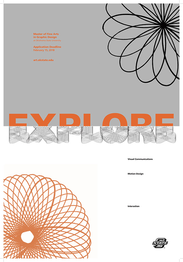
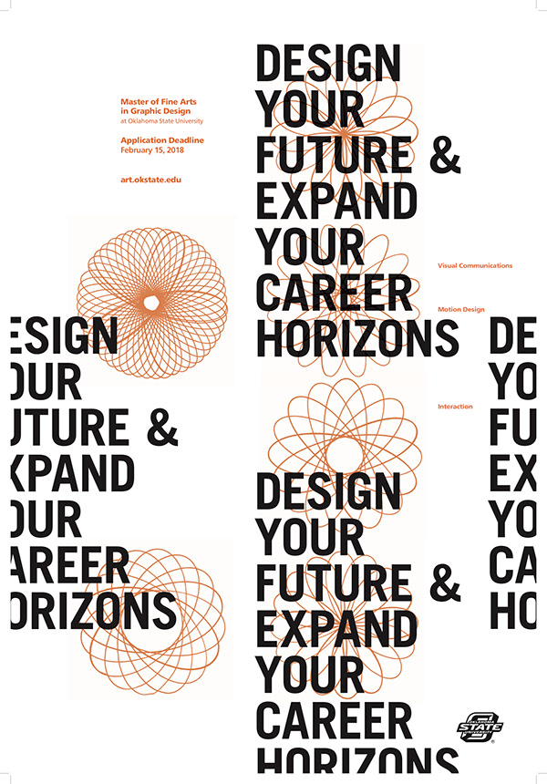
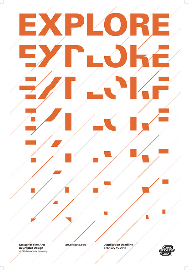
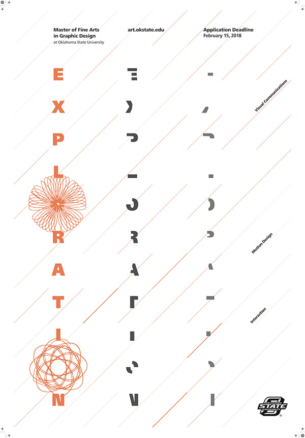
OSU MFA Poster


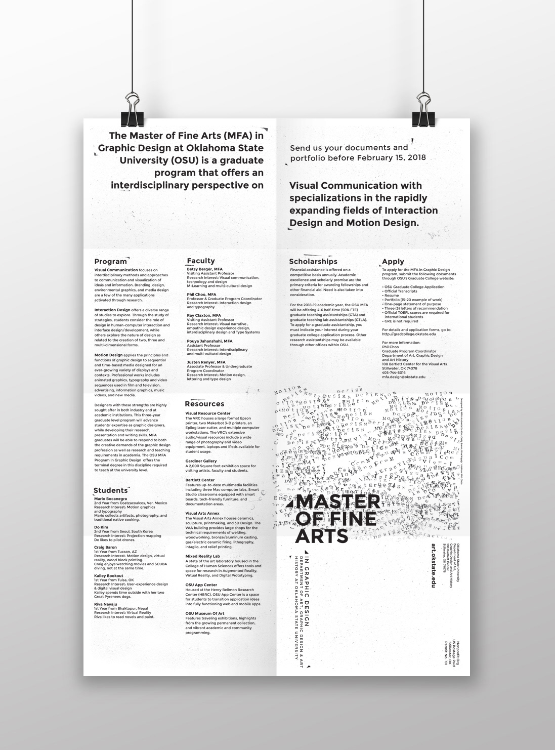
This is a poster design project done by stamping of the design method. The layers of stamps represent accumulated memory and knowledge and evoke receiving a stamp for a good grade in school or a passport stamp from a trip. During the program, one is making memories which are turned into knowledge and skills acquired during the program.


Sequential Design Book
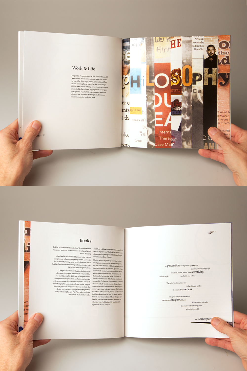
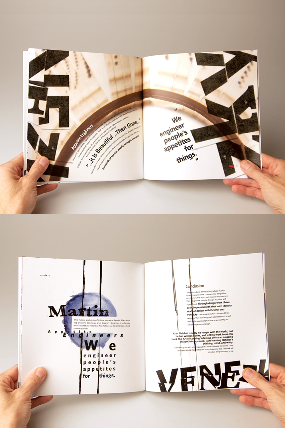
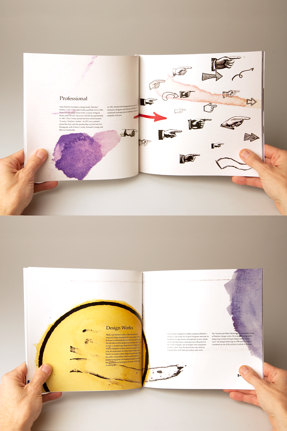
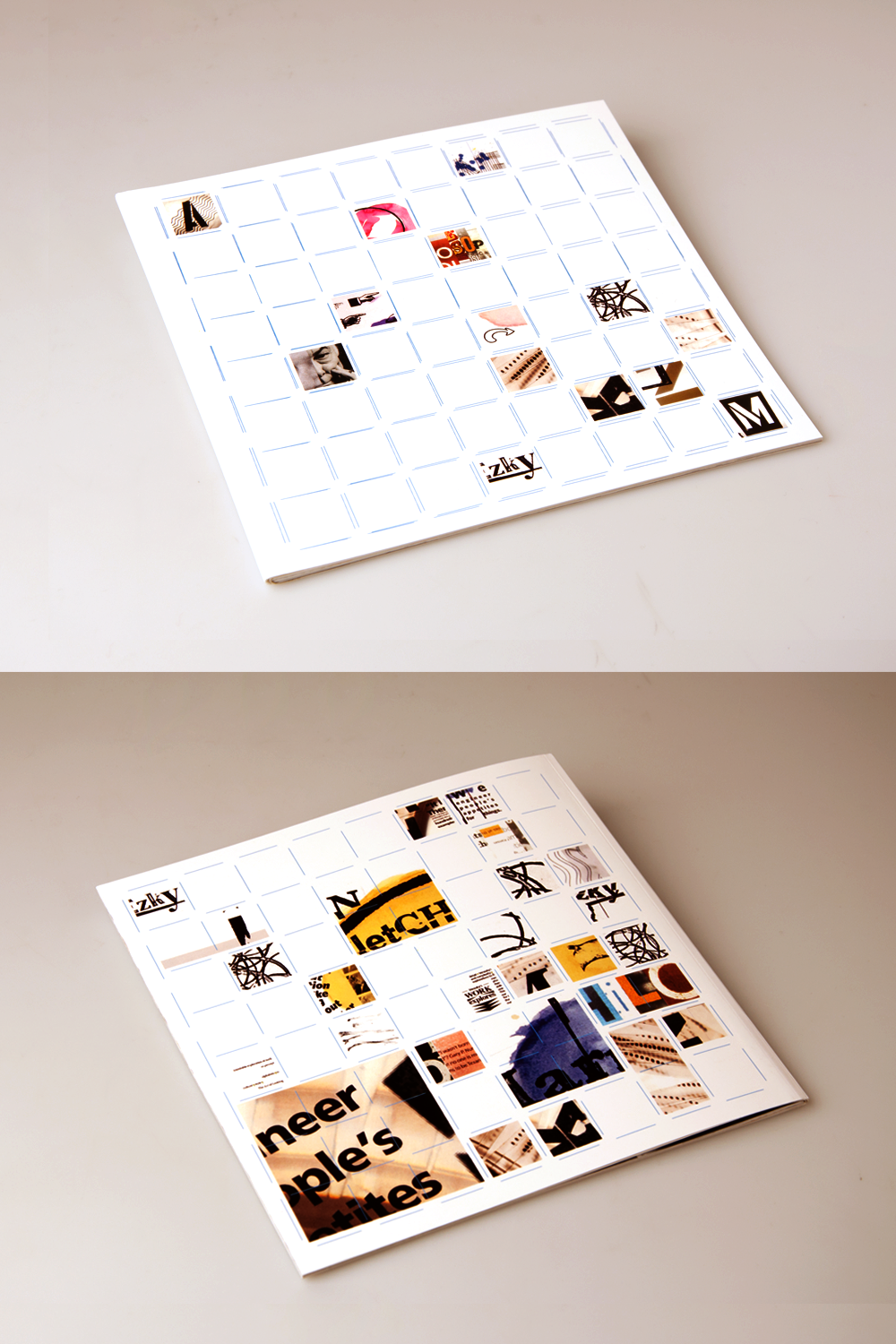
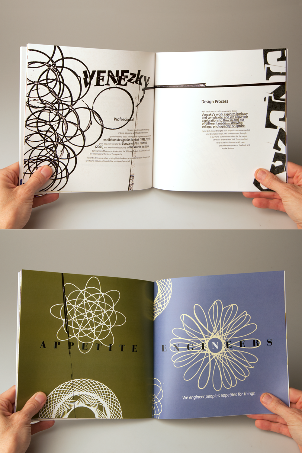
I created the sequential book design with two designers. The book size is 8.5X8.5. One designer named Alan Fletcher and the other one named Martin Venezky. Their design work influenced me and then I integrated their design work to create my own style. They do not use computer technology, but they used their hands to create. so, I follow suit by using my hands to create design work from two designers. All visual images such as watercolor, cutting letters, drawing lines, and so on were used on my hands into the sequential book.
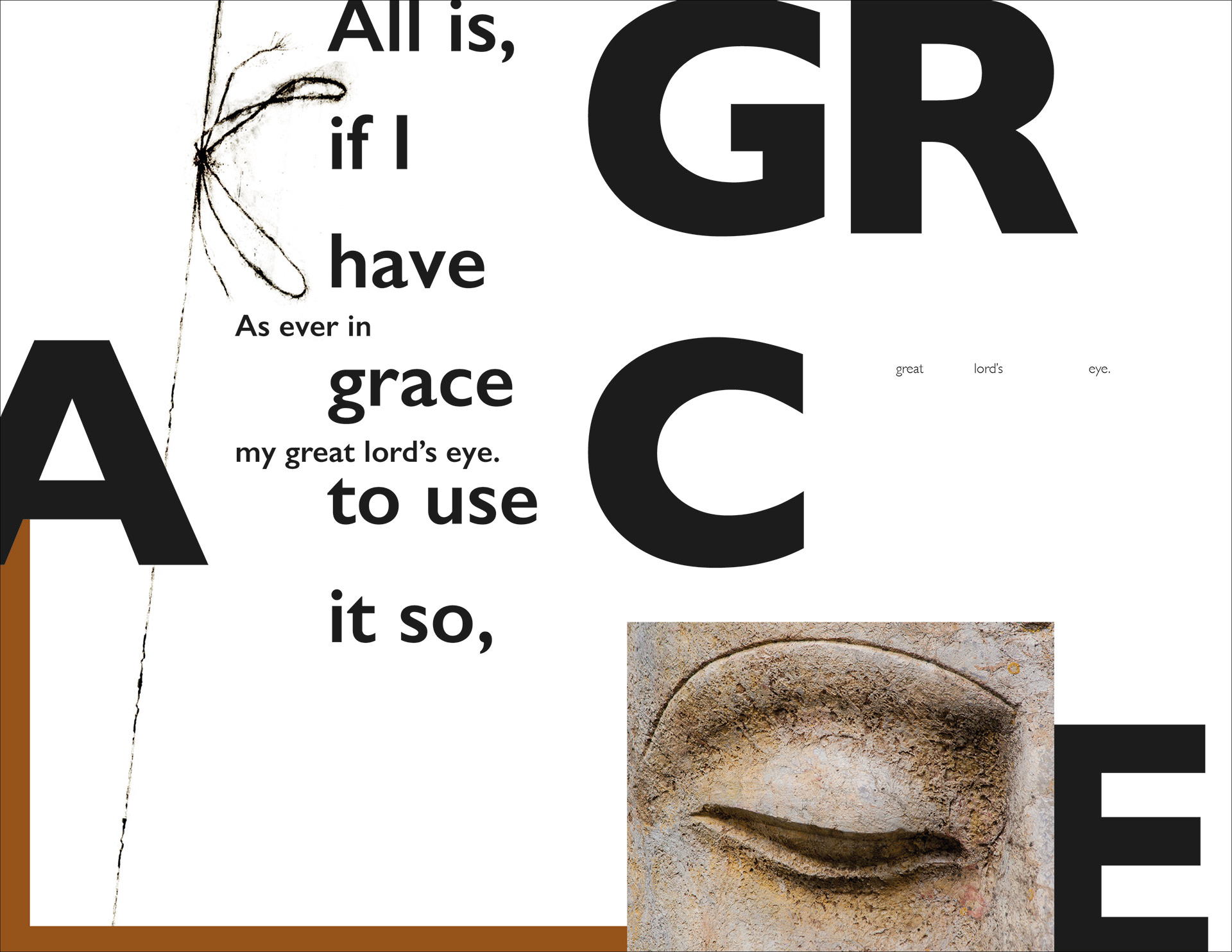
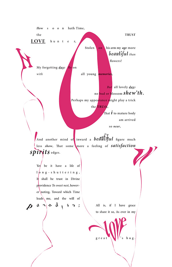
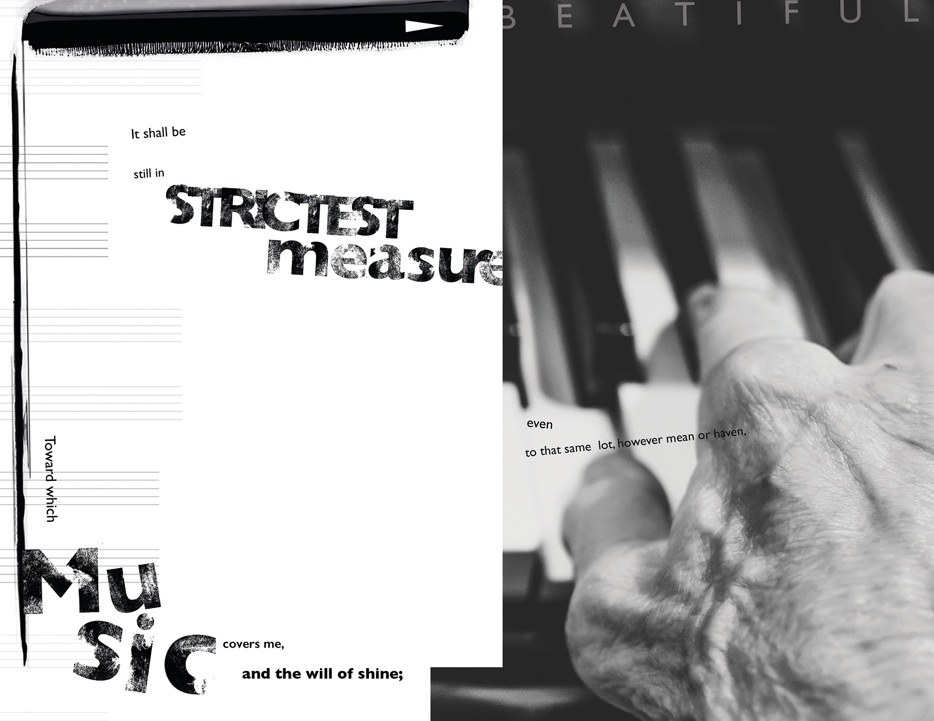
Concrete Poem Poster
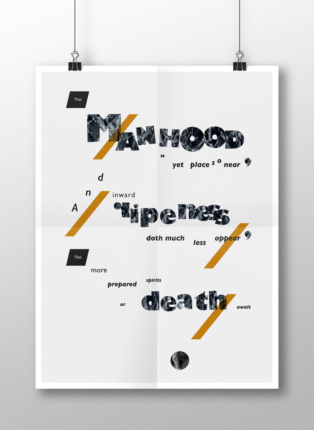
Concrete, pattern, or shape poetry is an arrangement of linguistic elements in which the typographical effect is more important in conveying meaning than verbal significance. It is sometimes referred to as visual poetry, a term that has now developed a distinct meaning of its own. The poster size is 18x24. The typography poster used a part of a verse in the poem. The theme is old in this poster. I only used 2 colors gold and black. I used texture expressed old to wrinkle printed letter for an old theme in a poster. The verse expresses rhythmically with a serif font.
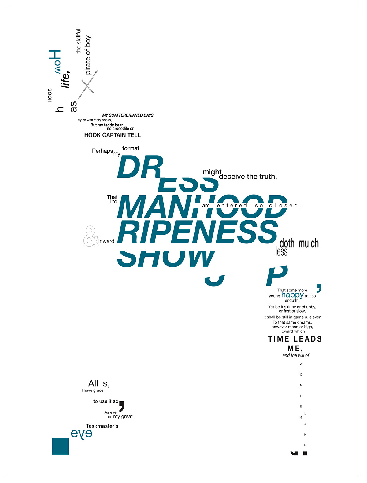
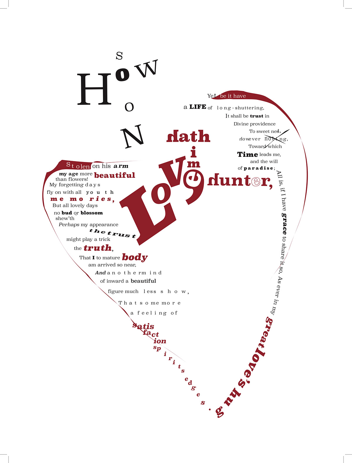
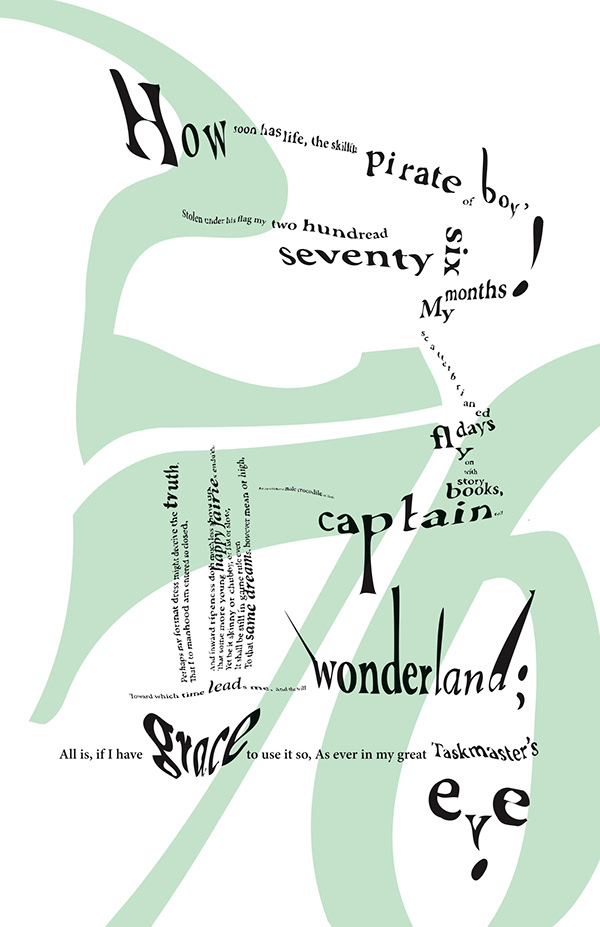

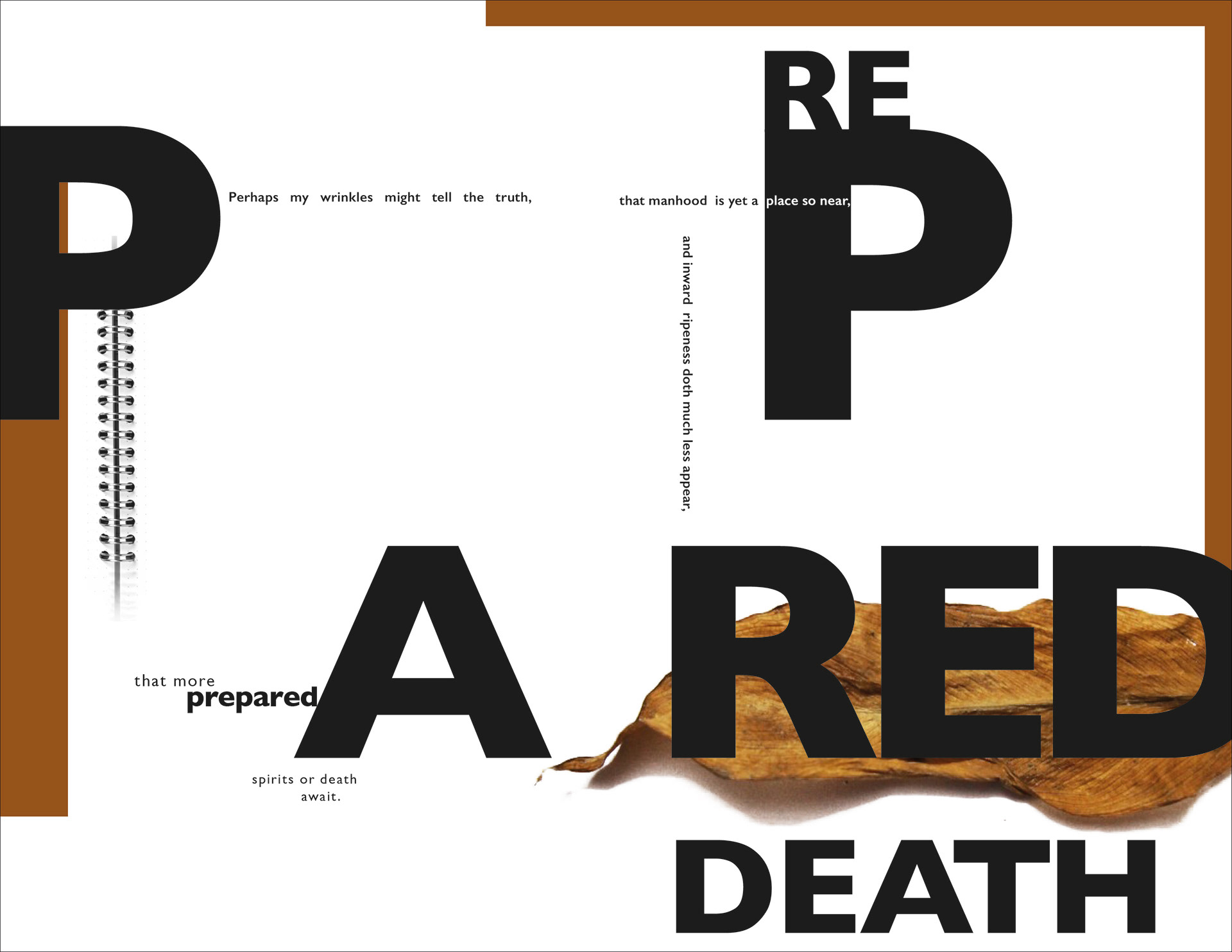
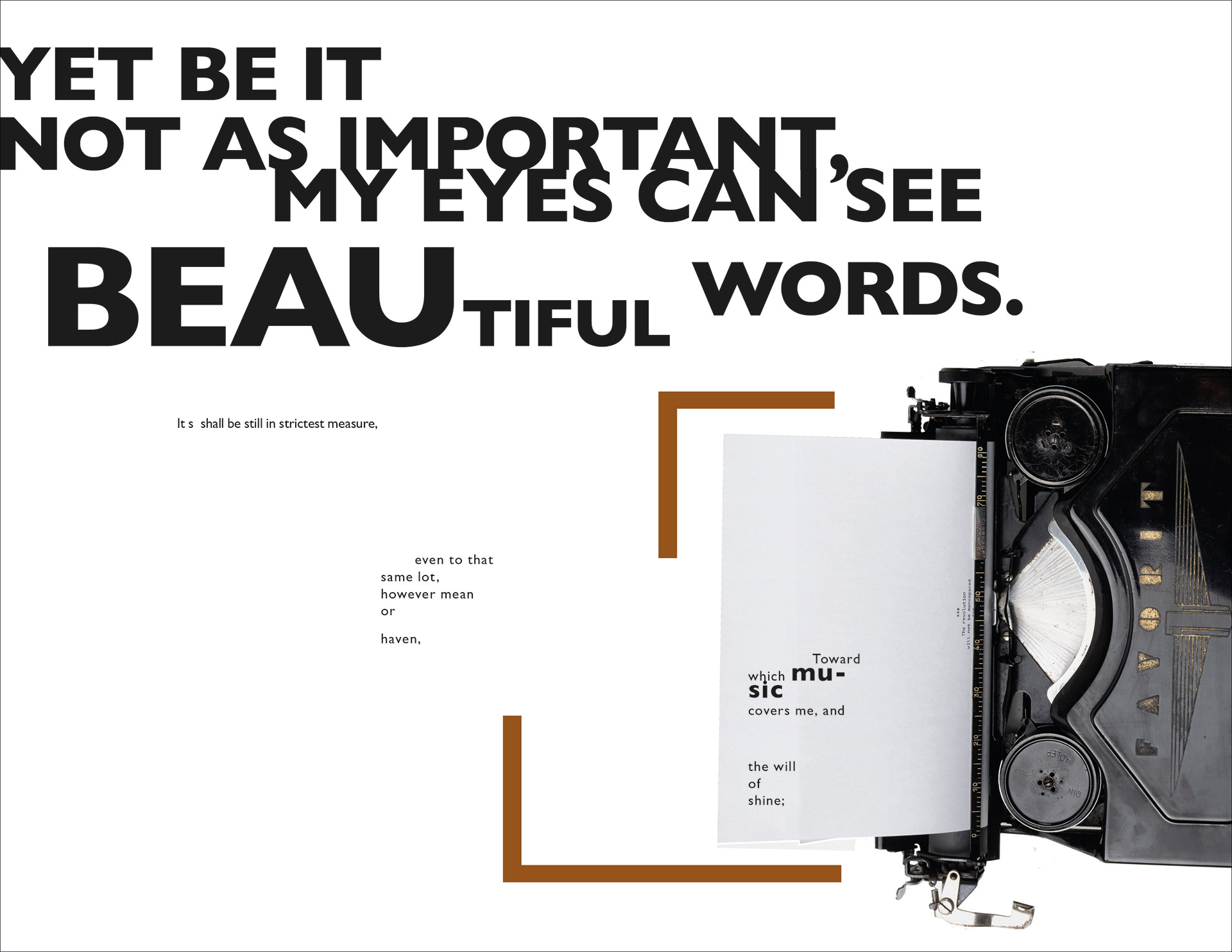
Concrete Poem Spreads and Process


This is the continuation of the Concrete Poem Posters project. This project was also part of my first year as a graduate student at Oklahoma State University. We were given the liberty to choose a poem or a quote to modify and introduce different words. As a result, these modifications switched the meaning of the original poem/quote. Once the quote was transformed, we had to visually represent meaning and emotion through a preferred method of image making. The final deliverable was three distinct booklets showcasing our results.